English
 Español
 Français
 lingua italiana
 Deutsch
 العربية
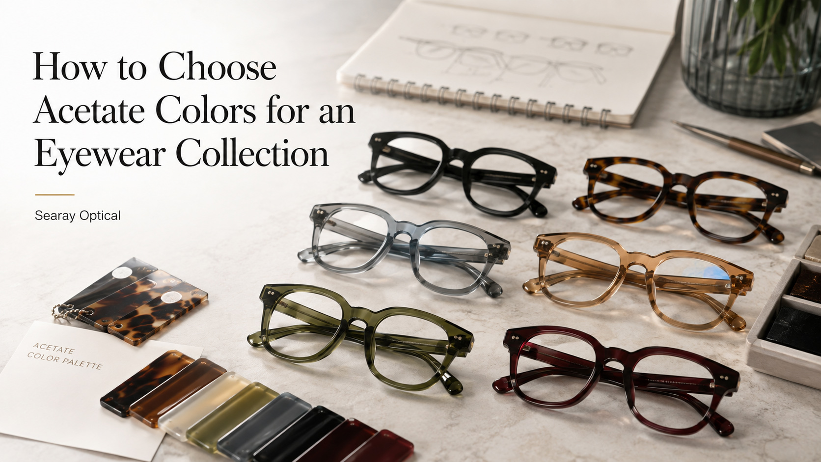
Choosing the right acetate colors is not simply about selecting the most attractive material sheets.
For an eyewear brand, color affects brand identity, customer acceptance, merchandising, and sell-through potential. A successful acetate eyewear collection normally combines commercial colors with a smaller number of distinctive colors that give the collection its own character.
Quick Answer: How Should You Choose Acetate Colors?
A practical acetate color strategy should consider five factors:
- Target market
- Customer age and gender
- Frame shape
- Brand positioning
- Balance between commercial and statement colors
As a general collection-planning rule, you can divide colors into:
- 50–60% core commercial colors
- 30–40% updated or fashion colors
- 10–20% statement colors
This keeps the collection easy to sell while still giving buyers something new.
1. Start With Your Target Market
Different markets may respond differently to the same acetate color.
Before selecting materials, define where the collection will be sold.
European Market
European eyewear collections often work well with refined, slightly distinctive colors such as:
- Transparent olive
- Burgundy
- Havana tortoise
- Transparent brown
- Champagne
- Crystal grey
- Soft blue
- Dark green
The key is often subtle differentiation rather than extremely bright colors.
U.S. Market
For the U.S. market, commercial colors remain important.
Common directions include:
- Black
- Dark tortoise
- Transparent grey
- Crystal
- Transparent brown
- Navy
- Olive
- Burgundy
For fashion-oriented collections, brighter transparent colors or layered acetate can be introduced as accent styles.
The goal is not simply to follow a country-specific trend. Color selection should also match the positioning of the retailer and target consumer.
2. Match Acetate Color With the Frame Shape
Color and frame shape should always be considered together.
A dramatic color on a very bold frame may become difficult to wear, while the same color on a thinner frame can look much more refined.
Bold Acetate Frames
For thick or oversized frames, consider:
- Black
- Dark Havana
- Transparent smoke
- Deep burgundy
- Dark green
- Layered tortoise
These colors give the frame presence without making it look overly complicated.
Thin Acetate Frames
Thin acetate designs can support lighter and more transparent colors, including:
- Crystal
- Transparent tea
- Champagne
- Transparent blue
- Light grey
- Transparent green
Because less material is visible, transparent colors can create a sophisticated effect without becoming too strong.
3. Build the Collection Around Core Colors First
One common mistake in eyewear collection development is selecting too many unusual colors.
Start with the colors that buyers already understand.
A commercial acetate eyewear collection could begin with:
C1 – Black
A reliable foundation color for optical eyewear.
C2 – Havana / Tortoise
A classic alternative to black with more visual texture.
C3 – Transparent Grey
Modern, neutral and easy to merchandise.
C4 – Transparent Brown or Tea
Warmer and softer than traditional black.
Then add one or two more distinctive colors depending on the target market.
For example:
C5 – Transparent Olive Green
C6 – Burgundy or Transparent Wine
This creates a collection that feels complete without becoming difficult for retailers to buy.
4. Use Transparent Acetate Strategically
Transparent acetate has become an important direction in modern eyewear because it allows designers to introduce color without making the frame appear too heavy.
Popular transparent directions can include:
- Transparent grey
- Transparent tea
- Transparent olive
- Transparent blue
- Transparent burgundy
- Champagne
- Crystal
However, the final appearance can change significantly depending on:
- Acetate thickness
- Polishing
- Lighting
- Metal core color
- Lens color
- Material layering
For this reason, eyewear brands should evaluate actual material samples whenever possible rather than relying only on digital color references.
5. Combine Solid and Patterned Acetate
Not every frame needs to use one material throughout the entire design.
Combining materials can create more recognizable eyewear without dramatically changing the frame construction.
For example:
- Solid black front + tortoise temples
- Transparent grey front + patterned temple tips
- Brown front + lighter transparent brown temples
- Burgundy front + Havana temple accents
- Transparent olive front + darker green temples
Another option is to introduce a small contrast section on the temple instead of using multiple colors across the entire frame.
Small details are often enough to make an acetate collection recognizable.
6. Consider Gender and Customer Profile
Color selection should also reflect who will wear the eyewear.
Men's Acetate Eyewear
Men's collections often work well with:
- Black
- Dark tortoise
- Smoke grey
- Transparent brown
- Navy
- Olive
- Dark burgundy
For men's collections, color blocking usually works best when the contrast remains controlled.
Women's Acetate Eyewear
Women's collections can support a wider range of colors, such as:
- Transparent pink
- Burgundy
- Champagne
- Crystal
- Transparent green
- Light tortoise
- Transparent purple
- Blue-grey
The frame shape remains important. Softer transparent colors often work particularly well with cat-eye, oval and softly upswept shapes.
7. Avoid Choosing Colors Individually
An eyewear collection should look like a collection.
Instead of asking:
“Is this color attractive?”
Ask:
“Does this color belong with the other colors in the collection?”
Place all selected acetate materials together and check whether they share a consistent visual direction.
A six-color range might include:
- 2 classic colors
- 2 neutral transparent colors
- 1 fashion color
- 1 statement color
This gives optical buyers several commercial choices while maintaining a clear collection identity.
8. Develop Colors Together With Your Eyewear Manufacturer
Material selection should happen early in the eyewear development process.
Working with an experienced acetate eyewear manufacturer can help brands evaluate how a material will perform on a real frame rather than judging the acetate sheet alone.
Factors such as frame thickness, polishing, lamination, temple construction and metal components can all influence the finished color.
For brands developing custom acetate eyewear, Searay Optical can work with customers to develop frame designs and color directions according to the target market and collection positioning.
Instead of choosing isolated colors, the goal should be to create a coordinated range that works across the entire eyewear collection.
Final Thoughts
The best acetate eyewear colors are not necessarily the newest or brightest colors.
A strong eyewear collection usually combines:
Commercial colors + market-appropriate trend colors + a small number of recognizable statement colors.
Start with the target customer, select the frame shapes, build a commercial color foundation, and then introduce distinctive acetate materials carefully.
This approach can help create an eyewear collection that feels fresh while remaining practical for optical retailers and distributors.
If you are developing a new acetate eyewear collection, Searay Optical can support custom eyewear development from frame concepts and acetate color selection to production.
Frequently Asked Questions About Acetate Eyewear Colors
What are the most versatile acetate colors for eyewear?
Black, Havana tortoise, transparent grey, crystal and transparent brown are among the most versatile choices because they can work across different frame shapes and customer groups.
How many colors should an acetate eyewear style have?
For many wholesale eyewear collections, four to six colors per style provide a practical balance between variety and inventory control. The ideal number depends on the brand, order volume and target market.
What acetate colors are suitable for men's eyewear?
Black, tortoise, transparent grey, brown, navy, olive and dark burgundy are strong starting points for men's acetate eyewear.
What acetate colors work well for women's eyewear?
Popular directions include crystal, champagne, burgundy, transparent pink, transparent green, light tortoise, grey and other soft transparent colors.
Should every frame in an eyewear collection use the same colors?
No. The collection should share a consistent color direction, but different frame shapes can use slightly different materials. Bold frames may need more neutral colors, while thinner frames can support lighter or more transparent acetate.
How do I choose acetate colors for a private label eyewear collection?
Start by defining your target market, retail price level, customer profile and frame shapes. Then select core commercial colors before adding trend and statement materials. Working with an acetate eyewear manufacturer can also help evaluate how the selected material will look on the finished frame.
Can Searay Optical help develop custom acetate eyewear colors?
Searay Optical works with eyewear customers on custom acetate frame development and collection planning. Color directions can be developed according to the target market, frame design and desired brand positioning.