English
 Español
 Français
 lingua italiana
 Deutsch
 العربية


"The Pantone Color of the Year reflects what is taking place in our global culture, expressing what people are looking for that color can hope to answer.” added Laurie Pressman, Vice President of the Pantone Color Institute. “Creating a new color for the first time in the history of our Pantone Color of the Year educational color program reflects the global innovation and transformation taking place. As society continues to recognize color as a critical form of communication, and a way to express and affect ideas and emotions and engage and connect, the complexity of this new red violet infused blue hue highlights the expansive possibilities that lay before us."
Displaying a carefree confidence and a daring curiosity that animates our creative spirit, inquisitive and intriguing PANTONE 17-3938 Very Peri helps us to embrace this altered landscape of possibilities, opening us up to a new vision as we rewrite our lives. Rekindling gratitude for some of the qualities that blue represents complemented by a new perspective that resonates today, PANTONE 17-3938 Very Peri places the future ahead in a new light.
PANTONE 17-3938 Very Peri is a new Pantone color whose courageous presence encourages personal inventiveness and creativity. It's time to let these creative ideas flow and consider how to incorporate this unique color into eyewear design. Sharing Some ideas with you!

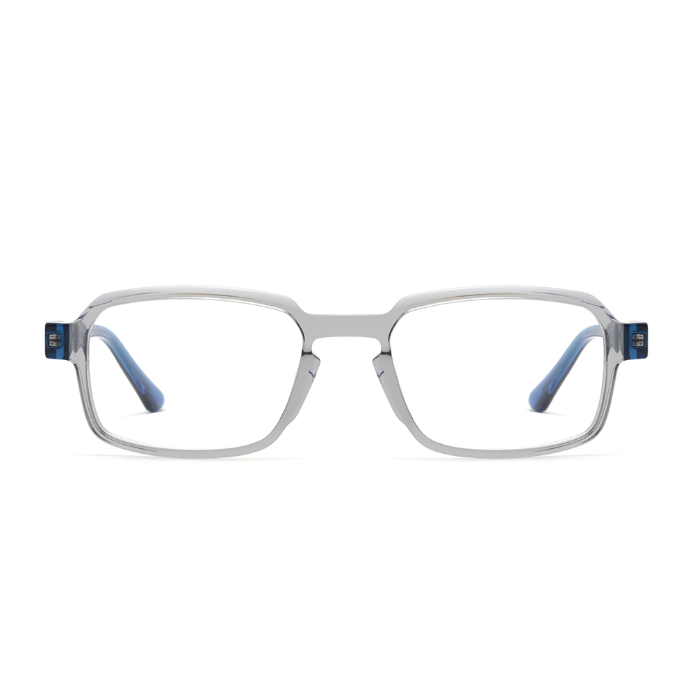
This style is with a very digital feel. In addition to periwinkle, it is paired with blue in the lower part of the frame. It makes the glasses richer in layers. For the sheet acetate selection, we gave up the solid color and used transparent color, which is false and real. It expresses that we are trying to open the door of the metaverse world. People never stop exploring new worlds.

Futuristic aside, as far as innovation is concerned, don't forget that periwinkle is also a very healing color. Simple metal wire and butterfly eyeshape are very comfortable and relaxed. Periwinkle tips are an important finishing touch. It brightens up the whole design and softens everything up. Not overbearing but not losing the memory point.

We were surprised to find that when watermelon red was mixed with some periwinkle blue, it was very dreamy and romantic. I don't think any girl would say no to this color. And the acetate sheet became a very good material to achieve this color. The combination of cat eye and butterfly shape and golden metal temple, as if a light girl dancing in the flowers.